Imagine people walking into your home and oohing and ahhing as they move throughout the spaces. They complement you and say “did you use a decorator?” You smile and say “oh heavens no, we did this ourselves” with such satisfaction and joy! That is what Creating Color Flow in your home can do for you!
If you are thinking that would never happen at my house, think again! It is super simple once you realize that color flow ties your home together in a way that presents a strong focus that speaks your language.
The key to making a home look professionally decorated begins with the selection of the color palette.
Most people make a mistake going to one room in their home and deciding to update it and go all out with new color on the walls, new window treatments, furniture and art with little to no regard to the adjoining rooms decor.
When I was newly married, I picked my favorite color for the bedroom and then another different favorite color for the living room. Each room was a theme…we picked ZOO ( I know we were really young), but pictures of Leopards and Zebras were really in style and we loved it! The next room could have been Coastal…CLASH!
In our next home, we had enough money to use some wall treatments as paper was becoming very popular. Pale Aqua and Peach were the raging trend and we did our foyer and hall bath in those colors, but with Blue and Mauve coming in style, our family room went in that direction. We had another version from our first home of Rust and Blue in a patterned sofa. Now pair all of that with the ruffled cream colored curtains that were popular then and you have a house that keeps you guessing to say the least! It was the furthest thing from color flow you could imagine.
Now years later, I am an Interior Decorator, Stager and Realtor. I’ve had training and lots of experience in color flow in a home and how important it is when decorating for yourself as well as if you are selling your home.
When we first bought this home we decorated all of it at once so that we would have the same color themes throughout. The reason for this is that each year as the color story is released it is used in fabrics that make your bedding, pillows, window treatments, table cloths, plates, glasses, art, towels, etc. If you start with one room and wait 5 years to decorate another room, it is very likely you will not be able to match your color story. There are tricks to get around that, but that is for another post.
So how do you create color flow?
Pick a palette from one paint provider.
I just visited Sherwin-Williams and looked at their palettes. They show “the softer side” and “coastal style” as two of their palettes. Looking at them they have a very clear and distinct difference. The softer side shows muted tones and the coastal style is very clear hues. They both have multiple colors in the palette, more than I would suggest using in one home.
Benjamin Moore shows the 2016 color trend palette keeping with the muted gray toned blues, greens, yellows and grays as the most popular and a few bolder colors as well.
What is more important than the color itself is it’s Tone. Tone is the lightness or darkness of a color. It is also important what the undertone is. At this point in time, a gray undertone is very popular and mutes colors to a soft presence. So while you may go from room to room with a green, a blue, a gray, a yellow, you will have a continuous flow if the undertones are similar.
Here is one of my favorite color stories from Valspar:
Winter in Paris
Sage Morsel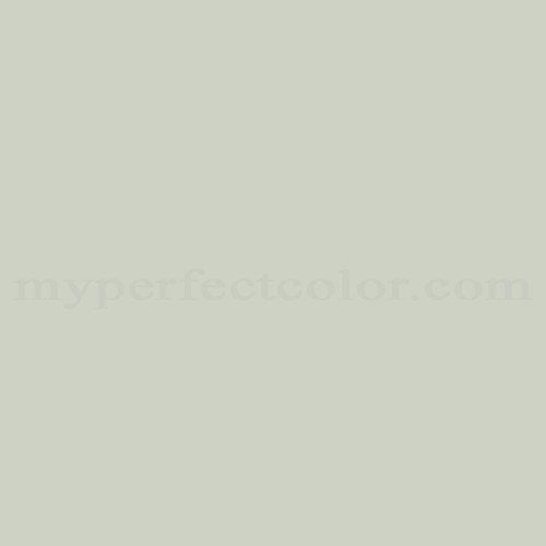
Madison Avenue
Summer Moon
These muted colors allow for lots of expression in each room and pops of color throughout the home. They do not clash with each other but instead they embrace each other and that is important when walls join or rooms open into each other without doors. It is pleasing to the eye to see the flow. You could decorate with Greens and Corals and Aquas from room to room or Navy, Grays, and Muted Reds. Really just about anything could work.
If this was for a client I would have interviewed them about their likes and dislikes while also taking in what they are decorating with in their home currently. Sometimes what we use as art or the nick knacks we display shows more about our likes than we are capable of articulating. You buy what you are attracted to. So if this person had bold colors and animal prints, I may not select this color story. However, the beauty of this color palette is that you can bump it up with bold furniture selections or window treatments. They provide the perfect backdrop for something special to shine in.
But just to give you another idea of keeping the color flowing through your home, here is another color story I would use from Behr:
Big Surf
Tomorrow’s Coral
Tropical Trail
Rise and Shine
These colors are clearer in tone. They are definitely brighter. I would recommend them in a coastal vacation rental cottage where happy and bright colors are a welcome choice for those looking for that tropical escape. Renters want colors that mimic the sea, the sunset, the palms. But if someone was truly into Traditional, I could pull together a home that would make these colors truly a stunning backdrop for the patterns in window treatments and upholstery.
Don’t Let Fear Hold Your Paint Brush!
The good thing is that if you are feeling a little bit scared about making the color selection, there are palettes surrounding any color that you like. You can also purchase a sample of your colors and put them inside your home next to each other and see if they look like a flowing color story.
I hope this inspired you if you are considering making a color story in your own home. You probably know what colors you are drawn to. If you love modern decor buy Architectural Digest and browse for a room that you love. If you are a little more on the traditional side, get a copy of Traditional Home and do the same thing. In love with the coastal look…Coastal Living is for you. Whatever your style there is a magazine out there filled with pictures to help you start your process.
BTW…I am partying at 21 Rosemary Lane
Do you think you can do it yourself? I would love to hear your thoughts.

 Top
Top

This is so useful! This will be great for when my husband and I buy our own home and can decorate it the way we want.
thank you Kourney…I hope that day comes sooner than you think~
This is such great information Debbie. I am pinning this for later reference.
Thank you Lisa! I hoped it would be useful to someone 🙂
So many great tips! I will be sure think about them when I’m doing my next project!! Thank you for sharing 🙂
I love the Madisn Avenue. We are set to paint next on our update list and generally use colors from our inspiration piece which was a book by Charlotte Zolotow about the sea. Lol I love that book and the Artlwork is fantastic.
I agree Pamela, finding your first color inspiration from an art piece or furniture is definitely a wonderful way to go. You know you will love it. Even if you are going from one room to another using a different art inspiration, keeping your tones similar not colors, will keep the flow.
Thanks for a great post Debbie!! I am definitely in the “one room red, one room yellow, one room green” camp. Your ideas make a lot of sense to pull a house all together!!
Appreciate that coming from you since we are both in the business of homes!
Great advice!! My house is slowly transitioning from the every room a different color syndrome, lol!
Thanks Susanne, but I don’t want to give the wrong idea. A different color is totally great in fact I recommend it, just keeping that undertone in a similar intensity will help it all seem to go together.
This is really helpful. My kids each want their own colors in their bedrooms and sometimes I end up with a hodge podge of a house that does not look pulled together at all.
Thanks Mary…but they can still have their own colors if you want their rooms to be part of the flow, just keep that undertone in the family. Lots of kids like a more clear neon color and yes that won’t probably flow with the rest of the home..but if I wasn’t planning on selling, I would totally let my kids have what they love.
Thank you for sharing these tips! pinning for reference and to share!
Appreciate it laurie!