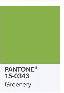
In case you were unaware, the Pantone Color of the Year is Greenery. To read more about the history of Pantone and how to make this year’s color work in your home, read this. However, there is also a Spring Collection put out by this same company and it is geared towards fashion. To be sure it also ends up influencing everything you put into your home from candle colors, to napkins, pillows and plates. I am starting a SERIES on Color Combining and today I want to talk to you about using that collection to color combine and make the most of using it in your garden.
Because I don’t want you to have to go back and forth from the previous post about the collection, I am popping the Pantone Spring Color Collection below.
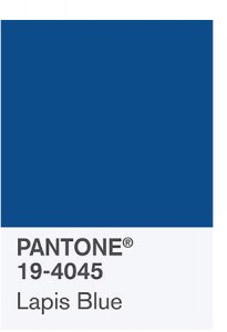
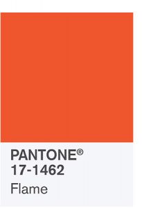
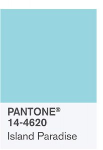
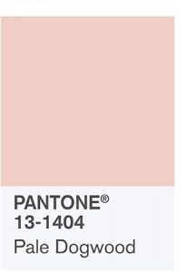
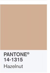
There are 10 color selections below.
- Look them over and pick the ONE you LOVE the most. Don’t think about your home right now because that is a trap that keeps you locked in to something that may not truly be you.
The most difficult thing for me is picking one. I scroll through and see color combos that make my heart sing and I want to use everything!
- Now that you picked one color, scroll through again and see if there is another color that you like equally or next in line.
Because this color palette has been designed to compliment each other, you really can’t go wrong with your selections.
- You may also pick a third color to thread through the room or in this case garden as well, but this one will not be in anyway dominate.
The 2017 Spring Color Palette of the Year!
Niagara 17-4123
Primrose Yellow 13-0755
and of course
Greenery 15-0343
What Are Your 3 Color Selections?
(my posts may contain affiliate links)
Now you have 2 -3 colors. Let’s do something with it. I want to actually take it outside today. I want to plan my garden and update my curb appeal. Did you think this was only for your walls and pillows?
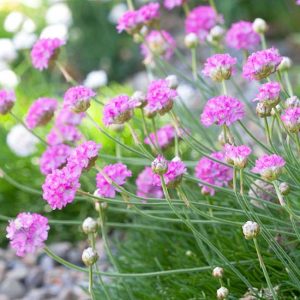
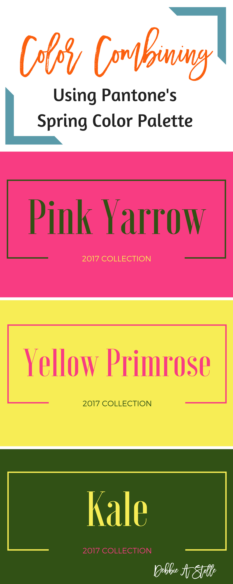
I selected Pink Yarrow for my Primary Color. Reason? I think Pink is happy and I love it. It also comes in lots of annuals for my garden. 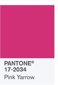
I selected Primrose Yellow for my Secondary Color. I selected Yellow because Pink combined with Yellow feels extremely youthful and carefree. It reminds me of plaid seersucker shifts, summer drinks and seems delicate in its presence. There are also lots of Yellow annuals available for my garden.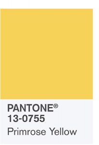
I also am adding Kale for my Third Color. When I first saw Kale in the color palette, I didn’t like it. However, this past week I just purchased a muffin colored dress with long vest over it in Kale. There were also sandals and a necklace in Kale and it was so pretty together. It definitely has a fall vibe paired with something from the brown family, but I loved the look. So when it came to the third color, Kale looked amazing with the Pink Yarrow and as a less dominant color will definitely enhance the Primrose Yellow outside as well.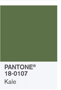
Selecting the Plantings
Before I even go look at my garden and house, I am going to quickly look at some plants that I may want to order now in seed form to get started.
Pinks
This Rose Thrift in Pink is a perennial made for rock gardens.
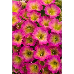
Supertunia Daybreak Charm is absolutely darling in both Pink and Yellow. I hope I can find this one in particular.
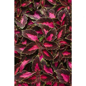
Color Blaze Velveteen Coleus brings out Pink with a touch of Kale. I like using a leaf pant with texture and color that grounds many of my blooming plants.
Now for some Yellows
Believe it or not, these are Marigolds. When selecting plants of any kind, I also look at the Deer eating factor. We probably have 6 deer that routinely sleep in our side yard every evening all year long. Beyond that, there are many more roaming. If they are hungry enough they even eat my roses thorns and all. We do use deer repellent because I love Hostas and that is one of their favorite meals! Marigolds are not on their diet, however, so always a good choice and a fairly hardy plant.
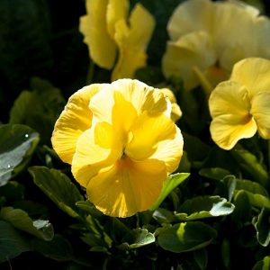
Pansies are the friendliest flowers. They are much more cold tolerant than you would imagine. We can actually put them out in late February in Missouri and they will brighten up the drab landscape immediately. I think these may be easy to find, but I will have to order since the typical pansies that show up in my lawn and garden shops are mixed with purple.
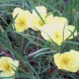
This is the Missouri Primrose, a small and delicate flower suitable for my beds or in pots on my porch.
I am going outside today to take some photos of my dead yard and start drawing up the plans based on these and a few other plants I have spotted. I will be thinking about my pots for my front porch and hangers that I may want to use. I can’t wait to have you come back and check out my blooms later this Spring!
Other Things to Consider When Updating Your Curb Appeal With Color
- House Color
- Shutter Color
- Front Door Color
- Trim Color
- Potted Pants
- Pillows for seating.
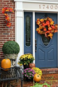
I have a brick front home, so I would not be making any major changes colorwise with that. However, I have shutters in need of paint and I took the Kale out to give it a look and was not too impressed with it against my brick. But when I put it at my door which is trimmed out in White, the Kale really looked like a great color. It is not loud, it is unique and the trend for the past several years in our area was to go back to the basic Black door. This color gives that same stately presence but in a fresh way. Now I have to convince my husband and then we have to get permission from the HOA to go forward with it.
Here is my door from this past Fall. Can you imagine it in Kale? I think it would be amazing.
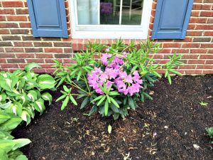
The shutters are very close to a faded Niagra now, so perhaps just freshening them up with that color will make it look great, but I am one who if I am going to paint, I really want to make a major change, so I will give this some more thought. I will look at Black, but that is boring to me. I will look at some of the shades related to Kale, so perhaps a darker shade of it and then I will just look at other colors that would complement my brick.
Here is a photo from last Spring where you can see my shutters and brick color. That Rhododendron did not make it through the winter so I have a big hole in my landscape. I actually lost two of them.
So what are your color combinations? What could you update on your home’s front to make your curb appeal more appealing? I would love to hear your plans and see your pictures when the changes are made!
Be sure to come back for my Home Tours this Spring as each month I will reveal the changes I made.
 Top
Top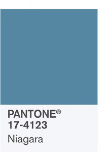



[…] Debbie is planning to update her curb appeal! […]