I love color, so for me it is exciting as it is for many in the design and fashion industry to see the reveal of the Color of the Year.
What is the Color of the Year About?
Pantone is the Industry Standard for color trends for the year, despite other claims on the color of the year by Paint companies or some furniture makers. Pantone has a Color Range of more than 2000 variations of color that have been standardized and that makes it an easy form of communication in the design industry worldwide. If you love a certain company, you may love their color picks for the year and still be able to influence your home and closet if they produce the products in those colors, but overall, Pantone will be the hands down influencer in the marketplace. You can purchase color books, software for graphics, design color books for designers and so much more from the Pantone Color Institute on color consulting and forecasting.
The Pantone Color of the Year: “A symbolic color selection; a color snapshot of what we see taking place in our culture that serves as an expression of a mood and an attitude.” Pantone.com
Twice a year, a Pantone executive and many other non-identified people representing companies, fashion, design and more, meet in an undisclosed location to discuss and dictate a color trend for the coming year. Some say that they look at what is already being used on the runways in Paris and while that may play a role, they literally look at multitudes of influence and bring together a concept for the color that they choose.
For example, this year’s Color Selection, Greenery, is described
“Bringing forth a refreshing take, Greenery is a tangy yellow-green that speaks to our need to explore, experiment and reinvent. Illustrative of flourishing foliage, the fertile attributes of Greenery signals one to take a deep breath, oxygenate and reinvigorate.” PANTONE 15-0343 Greenery…Pantone.com
Does the Color of the Year impact your home and closet?
I could say “Yes” and “No” to that question.
Your selections in purchasing home and clothing fashion products will definitely reflect the influence of the color forecast. The color trends will flow right into fabric design for pillows, rugs, curtains, and yes your clothes and shoes. It will also be seen in other textiles and supplies such as tile, carpets, furniture, nail polish, make up and even automobiles in some cases.
However, you don’t have to buy it. But here is where that still impacts you. The first time you hear the word “dated” to describe your home interior, exterior or the clothes you wear, you will know that you have been bitten by the ever changing color trending consequences of not trying to add or update. When we don’t add some of the newer color trends into our wardrobe or our home, we soon find ourselves looking like another era. This only has an impact if you are trying to sell your home, you are in the business of marketing or design, or you want to present yourself in a professional way and you are wearing clothes from 8 years ago that have none of the new color influences used to keep them looking current.,
How to make the Color of the Year work for you …
without Breaking Your Budget
The key to staying up with the current color trends is to use the small items in your home decor or wardrobe to swap out seasonally. Neutral sofas, whether white, gray, tan, brown, or navy, are all going to look amazing and fresh with pillows chosen with the color of the year.
Here are some other tips for making it work in your home:
- If you are really in love with the color and you need new bedding, buy it and incorporate the color trend there.
- If you love your bedding but you need to paint your room and the color would look great with your bedding, use it on the walls.
- If you love both your walls and bedding, add the color in a lamp, flowers, picture frame or other small accessories
- In a bathroom, towels
- In a kitchen, plastic utensils for cooking, towels, rugs, placemats, luncheon plates
- In your closet, a jacket, top, pants, scarf and you can team that color with complementary colors from last year’s wardrobe to update your look to the current color trends.
The 2017 Spring Color Palette of the Year!
Yes! There are MORE COLORS!
Tucked neatly inside this palette and working well with all of its companions is our Color of the Year : Greenery. But let’s take a look at what else is going to be coming out in fashion of home and clothes.
and of course
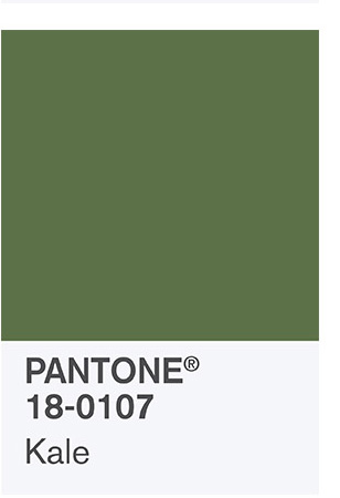
Just as there is a description of what Greenery means for 2017, each of the colors of the palette also have a description that you can read for yourself at the Pantone website.
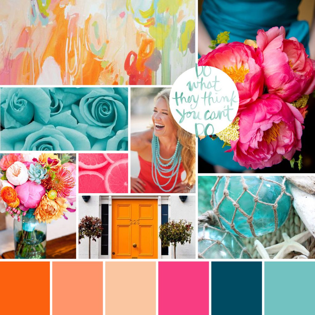
Funny, I can say that as I am working on a new blog theme (meaning background) for my website for the past few months. I created mood boards for my designer, Christine Capone, to come up with my color palette for my brand. Here is her interpretation of all of the pins I made to create the board. SNEAK PEEK!!!
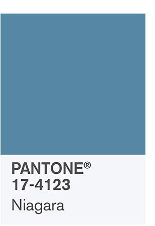
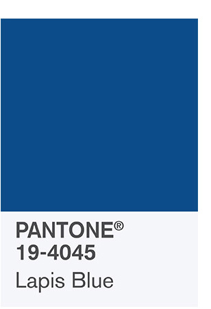
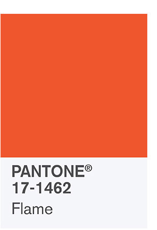
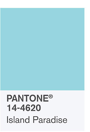
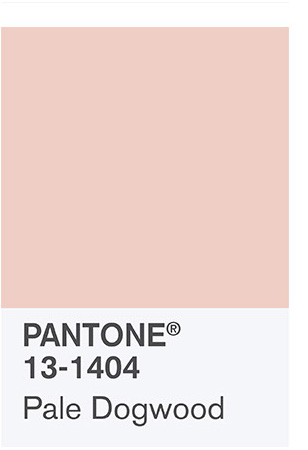
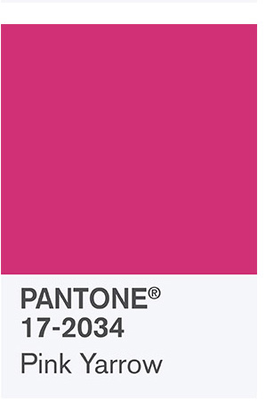
A close look at the Flame, Pale Dogwood, Pink Yarrow and Island Paradise with a nod to the Lapis Blue….seems like the folks at Pantone captured my feel for 2017 in a fairly close way!
Color impacts our life from mood to style to smiles and even triggering hunger or excitement, so find your color loves and impact your own life for change this year.
Do you have a favorite in that Spring Palette? What are your thoughts on the Pick of the Year, Greenery? If you enjoyed this post, please share!
PS. I am partying at Celebrate Your Story
 Top
Top
OH my! I knew there were color trends but I had no idea HOW they were chosen. I am very partial to greens, so greenery and kale are my faves, However, with that being said, I don’t use greens to decorate in my home. I have neutral colors on the walls so I can accent with whatever colors I need. I learned a long time ago when trying to sell a home to keep things neutral and accent with the popular color. Thanks for a GREAT post. I learned a lot!
Absolutely about the neutrals, which is why you only need to use these in your accessories and frankly with the greens, you can use true greenery! Plants would bring that color into a room effortlessly!
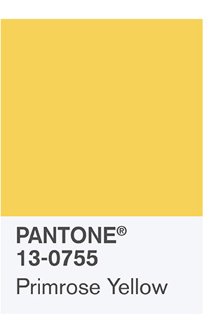
I love Niagra and Primrose Yellow!!! These colors are all bold and vibrant, I could see me using them in throw pillows or vases and a scarf!!
I am a little old school from the days when a yellow/green and bright pink were the go to in traditional homes, so I am excited about those two coming in again. Always love a little navy and yellow, island paradise…why not?
Loving that bright pink! These colors are so fun and exciting They make me happy and ready for spring! Thanks for sharing!
Sarah Bell
Trendy & Tidy
Sarah you are a girl after my own heart!
Nice job explaining design ideas as always! I can’t wait to see your new blog design! It looks happy!
Thanks Melony, Happy would definitely define me and what I am hoping it will say!
I love the pink Yarrow! Combined with the other colors it looks stunning. I have to think how I can incorporate this in my page, thanks Debbie, great post!
I actually love all of those colors. They look so great together! I am actually trying to come up with a better color scheme for my new blog. It needs a couple pops of color!
Me too! But I have to say I just love almost any color!! Mine will be out soon, I can’t wait.